
Instagram has updated one of the most recognizable parts of its branding, replacing the cursive wordmark it has used for the past decade with a new design that mixes cursive and print styles. The change is limited to the wordmark. Instagram’s familiar camera icon remains unchanged. Instagram head Adam Mosseri said the redesign was prompted by the fact that the wordmark had not changed in 10 years, describing the new version as cleaner and more modern while retaining references to the original design. Users have pointed out that the hybrid typeface can be difficult to read, with several saying the word […]...
Keep on reading: Instagram changes its wordmark for the first time in 10 years
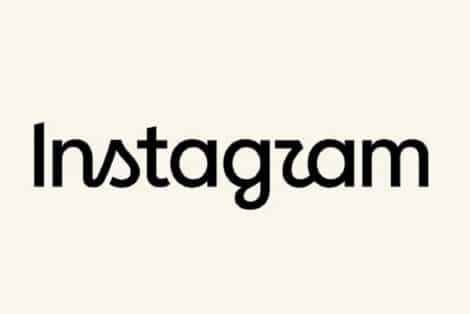
Instagram changes its wordmark for the first time in 10 years
Shown as published in the source's RSS feed — the text above is everything the feed itself carried. Follow the source link for the complete article on the publisher's own site; it opens in a new tab.